


Overview
Twindly is an AI-powered dating app designed to give users who may not stand out on traditional dating platforms but have unique personalities worth exploring a second chance at connection. In its initial launch, Twindly introduced an "AI twin" feature, allowing users to chat with an AI version of potential matches. However, this feature did not significantly boost match rates due to low engagement.
Our task was to identify the reasons behind this issue and develop strategies to enhance user interaction and improve match outcomes.
1
Timeline
The project spans for 3 months. The design team works alongside founder and PM
2
The Team
The product team has two designers
3
My Role
I am the senior UX designer of the product design team
Impact
After the redesign, we did one round of thorough user test with a group of users, and get the positive feedback from users.
Problem Statement
for current version
Low User Engagement with AI Twin
Users lacked motivation to interact with their AI twin, leading to low usage of the feature and little effect on match rates.
Lack of Personalized Interactions
User retention increased by 20%, with users giving positive feedback on the deeper connections enabled by AI twin interactions.
Limited Data for AI Optimization
Limited user input made it hard for the AI twin to create engaging conversations, reducing user interest and matches.
Design Questions
How can we boost engagement with the AI twin to build deeper connections and increase match rates on Twindly?
Design Process
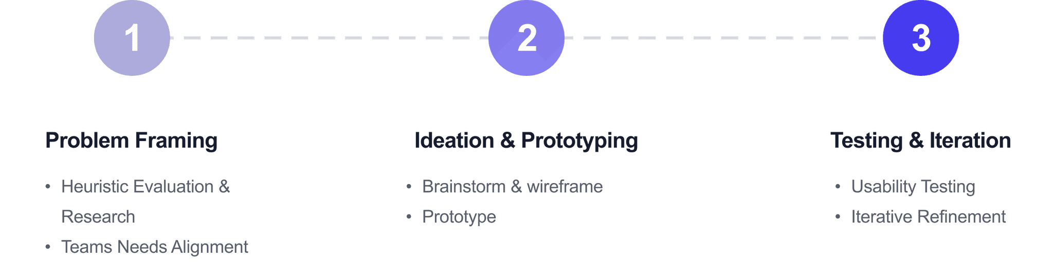
Process Overview
The process follows the design thinking methodology, starting with problem framing and progressing through design and evaluation stages.
01
User Research
Based on user interviews and user journey map, we identified the following two primary user goals:


02
User Flow
Optimizing itinerary generation experience to boost conversion rates and enhance business collaborations

The previous homepage was a user profile swipe page like most dating app and the user has the option to send like or dislike with the option to talk to the AI twin.

The updated homepage features a user pool, allowing users to choose someone they want to invest time in by interacting with their AI twin.

The match review page consolidates match request information into a card, allowing users to expand it to view detailed interactions from the requester and their AI twin.
03
Wireframing
Optimizing itinerary generation experience to boost conversion rates and enhance business collaborations

04
Key Features
xxxxxxxxxx
1
Send Match Request
Boost your match success by starting a conversation with a user's digital twin. Discover more about the person who caught your eye through a fun, interactive experience.
2
Review Match Request
Make smarter match decisions by seeing how each user interacts with your digital twin. Get to know potential matches effortlessly, and filter out unwanted connections with ease.
3
Build My Twindly
Easily create your own digital twin by chatting with it as if it were a real person. Let others get to know you on a deeper level without the need to engage in every conversation.
05
User Feedback
Profile Layout as a Card
"It’s hard to get an overview of someone’s profile without scrolling a lot."
Tag Scrolling with Right Arrow
"It’s a bit inconvenient that I can’t scroll through tags easily."
Tag Number Indicator and Match Requests
"I wasn’t aware of how many requests I had pending. A number indicator would be helpful."
AI Icon for Messages Sent by AI
"It’s a bit confusing when I see messages from the AI without any clear distinction."
06
Iterations From Previous Version
xxxxx
1
User profile layout

2
Review tab layout

3
My Twindly page layout

4
Chat list layout

07
Reflection & Take Away
1. The Power of Iterative Design
Reflection: The process of testing and refining helped us improve features based on real user feedback, showing how important it is to stay flexible and make changes along the way.
Takeaway: Iterative design not only fine-tunes features but also deepens our understanding of what users want. In future projects, it’s essential to allow time for multiple testing rounds to create a smoother, more user-friendly experience.
2. Balancing New Ideas with Familiar Patterns
Reflection: Adding innovative features like the AI digital twin and Passion Pulse was exciting, but we needed to make sure they felt easy and intuitive for users.
Takeaway: When bringing in new concepts, balancing them with familiar design patterns helps users feel more comfortable. For future projects, making innovative features feel approachable is key to helping users adopt them quickly.
4. The Importance of Clear Visual Hierarchy
Reflection: Placing key information, like the match rate, in a prominent position helped users find what mattered most, highlighting the need for a clear visual order.
Takeaway: A strong visual hierarchy allows users to access essential information quickly. In future designs, prioritizing the visibility of key information will improve usability and user satisfaction.